When consumers see your product on a shelf, they make immediate judgments. They decide very quickly whether they will inspect a product further or move on. This decision happens often in a matter of seconds, which makes the packaging design essential. Here are three key elements your packaging should emphasize.
COLOR SCHEME
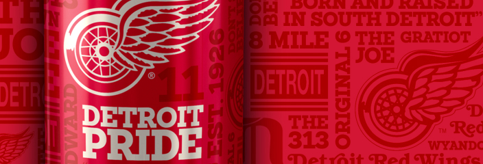
Colors capture the eye first. They convey emotions quickly and effectively. A bright color can suggest excitement. In contrast, calmer colors imply trust and reliability. Therefore, your choice of color should align with your brand’s identity.
Moreover, specific color palettes can appeal to certain demographics. For example, young adults may prefer vibrant and bold colors, whereas older audiences might prefer more subdued tones.
Colors do not just attract attention; they communicate the brand’s essence to potential buyers. As a result, a well-thought-out color scheme can make your product stand out in a crowded market.
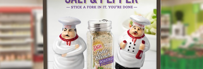
UNIQUE SHAPES AND TEXTURE
Beyond colors, the shape and texture of your packaging are crucial. Unique shapes make your product memorable. Consider the iconic shape of a Coca-Cola bottle or a glass bottle embedded in an aisle full of plastic bottles. Consequently, highly distinct designs can create a lasting impression.
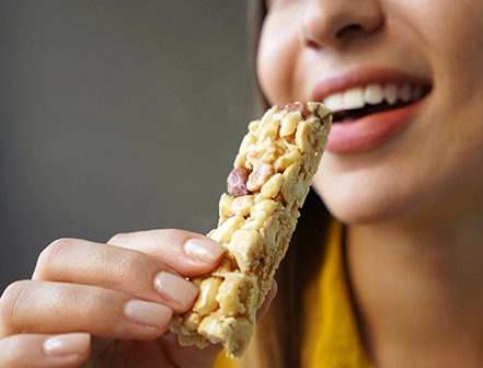
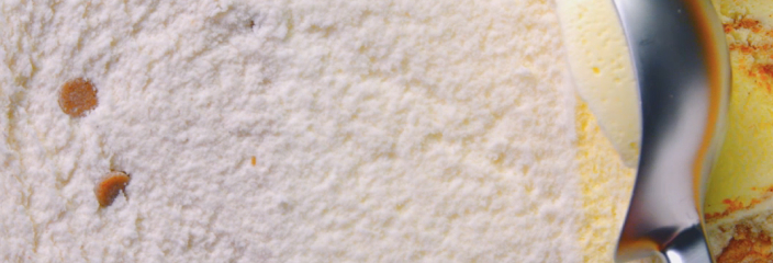
In addition, material choice also plays a role. Texture invites interaction. It makes people want to pick up and feel the product. Smooth, sleek surfaces might suggest a modern feel, while rough textures could indicate an organic product. Therefore, your packaging’s physical presence invites consumers to engage on a sensory level.
TYPOGRAPHY
Typography is the next element that demands attention. Font style and size communicate both clarity and brand personality. For instance, bold and clean typefaces can indicate confidence. Conversely, intricate fonts might suggest sophistication. Moreover, clear typography ensures quick comprehension. Important information stands out immediately.
Transition words and emphasis help guide the consumer’s eye across the packaging. Therefore, a well-placed font can emphasize your product’s most convincing messages. Thus, typography plays a critical role in not only catching attention but also retaining it.
QUENCH’S TAKE
At quench, we understand that your product’s packaging is a vital sales tool. It’s not just about aesthetics. It’s about creating an emotional response. When color, shape, and typography harmonize, they create a powerful connection with the consumer. This synergy doesn’t only attract attention. It also sparks curiosity. As a result, consumers feel compelled to explore your brand further.
Our expertise in food and beverage marketing ensures you capture attention and inspire action. Let us help guide your products from shelf to cart effectively.